Master Bedroom (ORC)
The Goal: Create a Bedroom Retreat
It took a long time to redo our bedroom at our last house, partly because it’s not one of those spaces many others see. But when I finally got around to doing it, I kicked myself for taking so long! We all spend so much time in our bedrooms and at the end of a long day it’s important to have a place to retreat, relax and unwind.
Fast forward to our new house. Although it wasn’t the first project I tackled (I don’t stay still for long!), when the Spring 2020 One Room Challenge with Better Home and Gardens geared up, I knew it was time. And I’m proud to say we closed the book on this one just days after the 1 year anniversary of moving in.
BEFORE:
The room is nice and big - so good bones, but zero personality. My goal for this bedroom was to create an oasis and place of calm. I also wanted to bring an element of the outdoors in by using natural features, such as a wood wall, plants, and a concrete (ok, maybe not so natural) fireplace. The room doubles as a home office for my husband, so I wanted the work area to be cohesive with the rest of the space.
AFTER:
Over the 8 week challenge, we transformed this space into a room full of warmth, interest and style.
We started with the chevron wood accent wall behind the bed. I wanted this to be the focal point of the room and kept its natural colour to keep with the calm and airy feel of the room. The rest of the walls are painted White Heron by Benjamin Moore.
One of my favourite additions to this room are the pendant lights that frame the sides of the bed and free up valuable space on our small side tables. They can be dimmed at night and add such a lovely glow to the room.
The previously plain side tables were given a small facelift with some white paint and gold feet to add more character. In our previous home, we had much larger side tables and honestly they just collected junk and added nothing to the space, so these smaller tables are perfect for keeping the essentials without being too cluttered and busy.
The addition of an area rug (Rugs.ca) helped anchor the space and bring warmth and cohesiveness.
Other changes like adding curtains to the windows and more modern MDF trim to the closet doors were inexpensive and easy ways to add a softness to the room.
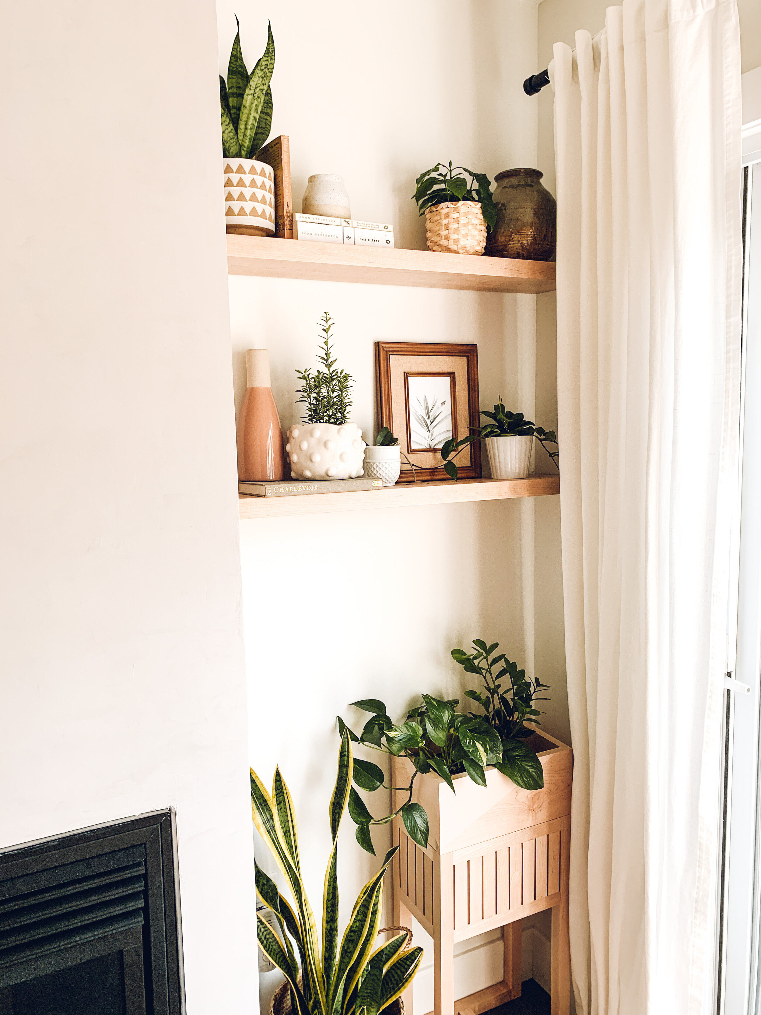
Transforming the other side of the room meant taking on an awkward fireplace mantle and air conditioner - both necessary but not very pretty to look at. Extending the fireplace framing gave the illusion of higher ceilings and applying Roman Clay (Washi, Portola Paints) gave the fireplace a concrete look and added interest to the space.
We added maple floating shelves beside the fireplace. To solve an AC vent dilemma, my husband built a planter that doubles as a cover for the vent and looks very cute at the same time.
Design & Construction: Ashley Lewchuk (Intentional Space)
Paint: White Heron (Benjamin Moore)
Pendant Lights: West Elm
Rug: Rugs.ca
Fireplace Roman Clay: Washi (Portola Paints)


